Keshif turns data into a beautiful live dashboard in seconds.

Keşif means discovery & exploration in Turkish.
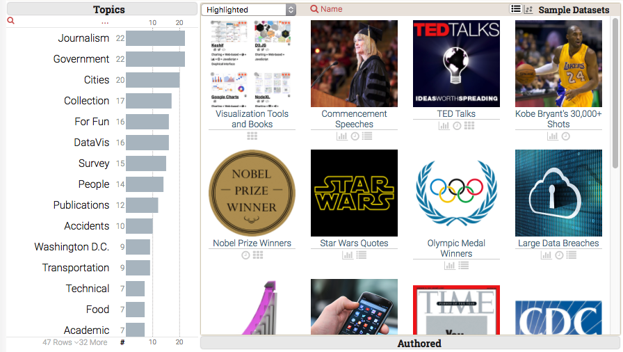
![]()
The easiest way to turn your data sheets and tables into a web-based exploratory dashboard.
Explore your data with the best practices at your fingertips. Keshif is a visual and interactive dialogue.
Save time and discover unexpected trends in an instant. Leave complex, costly tools and processes behind.
FEATURES
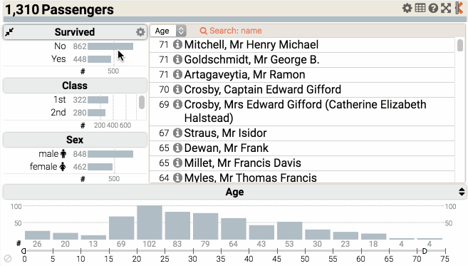
Effective, consistent out-of-the-box visualizations with zero effort.
No design tools or wizards needed. It's just magic for your eyes & data!
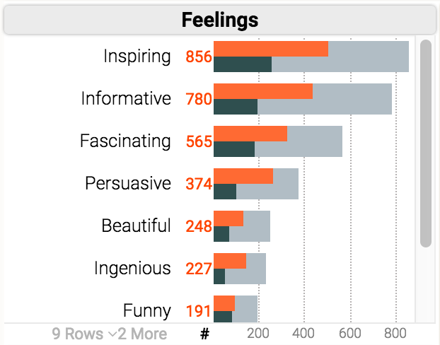
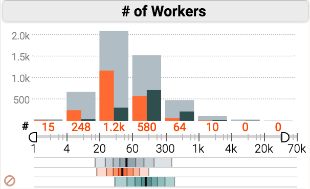
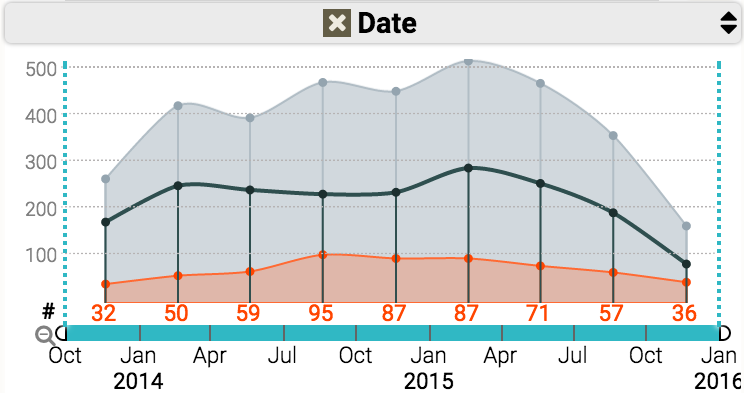
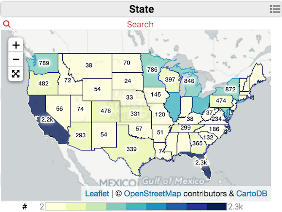
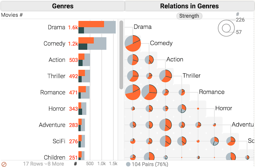
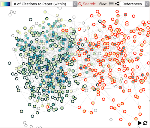
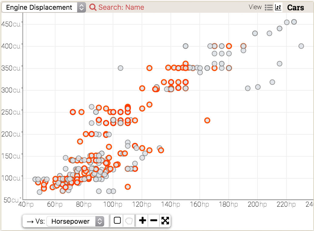
Bar-chart | Histogram & Boxplot | Line-chart | Map | Matrix | Network | Scatter plot | Time Series
Always and fully in-sync.
Intuitive and powerful.
No separate filters with complex setup.
Mouse-over to highlight.
Lock to compare.
Click to filter.
Watch how
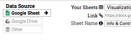
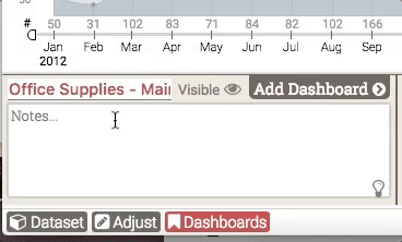
Import. Save. Share. No effort needed.
From importing data to saving and sharing dashboards,
Keshif is designed to work seamlessly.
Load your data from cloud, create unlimited dashboards, and share them with others. Your work is also auto-saved for you, privately.
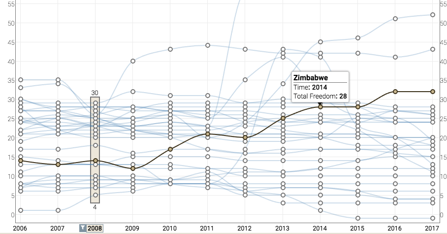
See trends by absolute or part-of relations with just a single click.
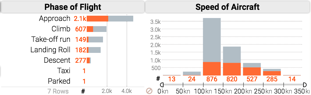
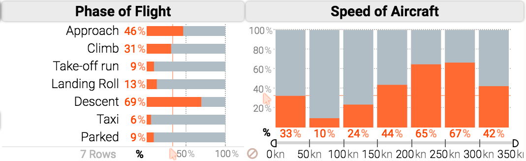
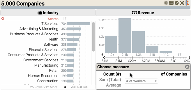
Calculate and measure trends
by count, total or average.
Control all charts at once.
We Open Data!
Static or limited dashboards were only the beginning.
We believe the public should actively explore, question, and learn from public data.
So, we make Keshif free for public data! And, with no limits in power!
For private data, and customized platforms on-premises, we offer affordable plans and pricing. Learn more.
From business intelligence to journalism, government to personal data, Keshif makes it no longer a complex luxury to take control of your data, and reach data-driven insights.